Toolbars as part of the jsPanel content section
Depending on your kind of application it might be feasible to use the jsPanel content section as container for toolbars.
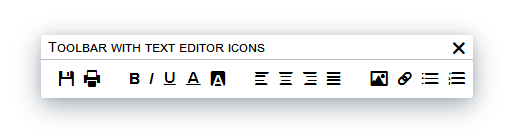
To do this we start with preparing the HTML for a toolbar:
// toolbar for example with header section
var tb = '<div style="padding: 8px;">'+
            '<i class="fi-save"></i><i class="fi-print"></i>'+
            '<i class="fi-bold"></i><i class="fi-italic"></i><i class="fi-underline"></i>'+
            '<i class="fi-text-color"></i><i class="fi-background-color"></i><i class="fi-align-left"></i>'+
            '<i class="fi-align-center"></i><i class="fi-align-right"></i><i class="fi-align-justify"></i>'+
            '<i class="fi-photo"></i><i class="fi-link"></i><i class="fi-list-bullet"></i>'+
            '<i class="fi-list-number"></i>'+
         '</div>';
Than we simply create a jsPanel and insert the toolbar using option.content
$.jsPanel({
    content:   tb,
    size:      {width: 425, height: "auto"},
    position:  "center",
    controls:  {buttons: "closeonly"},
    title:     "Toolbar with text editor icons",
    resizable: "disable",
    callback: function(panel) {
        // set some css styles
        $(panel.content).css({'padding':'10px 0'});
        $("i", panel.content).css({"cursor":"pointer", "font-size":"20px", "margin-left":"10px"});
        $("i.fi-bold, i.fi-align-left, i.fi-photo", panel.content).css({"margin-left":"30px"});
        // bind handlers to the icons
        $("i.fi-save", panel.content).on( "click", function() { alert("You clicked the SAVE icon"); } );
        $("i.fi-print", panel.content).on( "click", function() { alert("You clicked the PRINT icon"); } );
        $("i.fi-bold", panel.content).on( "click", function() { alert("You clicked the BOLD icon"); } );
        $("i.fi-italic", panel.content).on( "click", function() { alert("You clicked the ITALIC icon"); } );
        $("i.fi-underline", panel.content).on( "click", function() { alert("You clicked the UNDERLINE icon"); } );
        $("i.fi-text-color", panel.content).on( "click", function() { alert("You clicked the TEXT-COLOR icon"); } );
        $("i.fi-baclground-color", panel.content).on( "click", function() { alert("You clicked the BACKGROUND-COLOR icon"); } );
        // and so on ...
    }
});
Toolbar in content section without header
Now we might want the toolbar completely without the header section.
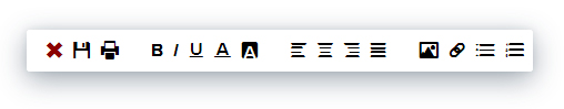
To achieve this we:
- add
removeHeader: trueto the jsPanel configuration - add
draggable: {handle: 'div.jsPanel-content'}to the jsPanel configuration because we need a handle to drag the toolbar around - add an extra icon that serves as close button
- remove
controls: {buttons: "closeonly"}andtitle: "..."form the configuration because the complete header section is removed
// toolbar for example without header section
var tb2 = '<div style="padding: 8px;">'+
            '<i class="fi-x"></i><i class="fi-save"></i><i class="fi-print"></i>'+
            '<i class="fi-bold"></i><i class="fi-italic"></i><i class="fi-underline"></i>'+
            '<i class="fi-text-color"></i><i class="fi-background-color"></i><i class="fi-align-left"></i>'+
            '<i class="fi-align-center"></i><i class="fi-align-right"></i><i class="fi-align-justify"></i>'+
            '<i class="fi-photo"></i><i class="fi-link"></i><i class="fi-list-bullet"></i>'+
            '<i class="fi-list-number"></i>'+
         '</div>';

$.jsPanel({
    content:      tb2,
    size:         {width: 465, height: "auto"},
    position:     "center",
    resizable:    "disable",
    removeHeader: true, // added to remove the header section
    draggable:    {handle: 'div.jsPanel-content'}, // added to have a handle to drag the toolbar
    callback: function(panel) {
        // set some css styles
        $("i", panel.content).css({"cursor":"pointer", "font-size":"20px", "margin-left":"10px"});
        $("i.fi-bold, i.fi-align-left, i.fi-photo", panel.content).css({"margin-left":"30px"});
        // bind handlers to the icons
        $('i.fi-x', panel.content).on( 'click', function() {panel.close(); } ); // added close icon handler
        $("i.fi-save", panel.content).on( "click", function() { alert("You clicked the SAVE icon"); } );
        $("i.fi-print", panel.content).on( "click", function() { alert("You clicked the PRINT icon"); } );
        $("i.fi-bold", panel.content).on( "click", function() { alert("You clicked the BOLD icon"); } );
        $("i.fi-italic", panel.content).on( "click", function() { alert("You clicked the ITALIC icon"); } );
        $("i.fi-underline", panel.content).on( "click", function() { alert("You clicked the UNDERLINE icon"); } );
        $("i.fi-text-color", panel.content).on( "click", function() { alert("You clicked the TEXT-COLOR icon"); } );
        $("i.fi-baclground-color", panel.content).on( "click", function() { alert("You clicked the BACKGROUND-COLOR icon"); } );
        // and so on ...
        panel.css("border", "2px solid #000");
    }
});
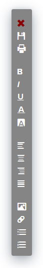
A vertical toolbar example
And now a vertical toolbar.
To do this I wrapped each icon in a div to have them appear vertically and adjusted the css a bit.
// vertical toolbar for example without header section
tb3 = '<div id="toolbar-v" style="background:#858585;color:#fff;padding:12px;">'+
        '<div><i class="fi-x" style="color:darkred;"></div></i>'+
        '<div><i class="fi-save"></div></i><div><i class="fi-print"></div></i>'+
        '<div><i class="fi-bold"></div></i><div><i class="fi-italic"></div></i>'+
        '<div><i class="fi-underline"></div></i><div><i class="fi-text-color"></div></i>'+
        '<div><i class="fi-background-color"></div></i><div><i class="fi-align-left"></div></i>'+
        '<div><i class="fi-align-center"></div></i><div><i class="fi-align-right"></div></i>'+
        '<div><i class="fi-align-justify"></div></i><div><i class="fi-photo"></div></i>'+
        '<div><i class="fi-link"></div></i><div><i class="fi-list-bullet"></div></i>'+
        '<div><i class="fi-list-number"></div></i></div>';

$.jsPanel({
    content:      tb3,
    size:         "auto",
    position:     "center",
    resizable:    "disable",
    removeHeader: true,
    draggable:    {handle: 'div.jsPanel-content'},
    callback: function(panel) {
        $('#toolbar-v div', panel.content).css({'cursor':'pointer', 'font-size':'20px', 'padding-top':'5px'});
        $('i.fi-bold, i.fi-align-left, i.fi-photo', panel.content).parent().css({'padding-top':'25px'});

        $('i.fi-x', panel.content).on( 'click', function() {panel.close(); } );
        $('i.fi-save', panel.content).on( 'click', function() { alert("You clicked the SAVE icon"); } );
        $('i.fi-print', panel.content).on( 'click', function() { alert("You clicked the PRINT icon"); } );
        $('i.fi-bold', panel.content).on( 'click', function() { alert("You clicked the BOLD icon"); } );
        $('i.fi-italic', panel.content).on( 'click', function() { alert("You clicked the ITALIC icon"); } );
        $('i.fi-underline', panel.content).on( 'click', function() { alert("You clicked the UNDERLINE icon"); } );
        $('i.fi-text-color', panel.content).on( 'click', function() { alert("You clicked the TEXT-COLOR icon"); } );
        // and so on ...
    }
});